Wishsift
Mobile App

Project Type
Concept Study
Industry
E-commerce
Services
Mobile App & AI Design

Overview

Wishsift explores shopping research through a mobile experience built around a side-by-side product comparison with evidence drawers. A shopping research app that connects product comparisons to saved evidence and personal priorities. The proposed journey connects shortlist capture, compare with ai, preference brief, decision journal. Four original phone showcases establish the visual direction, while the case study defines the supporting feature set and a proposed React Native architecture.
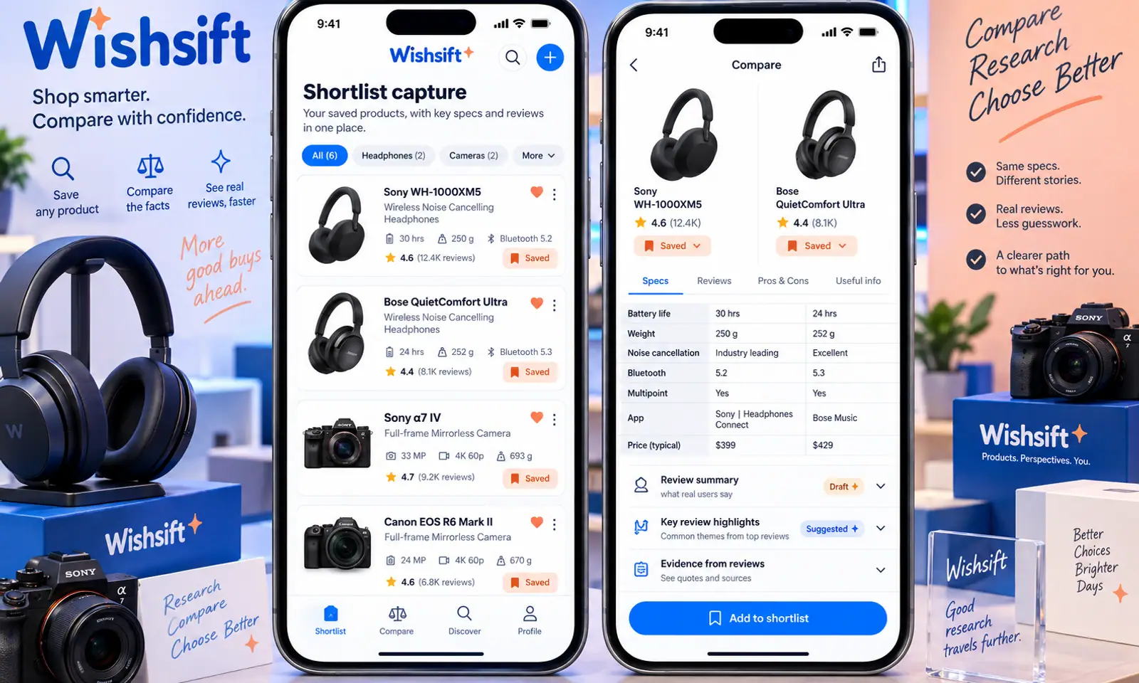
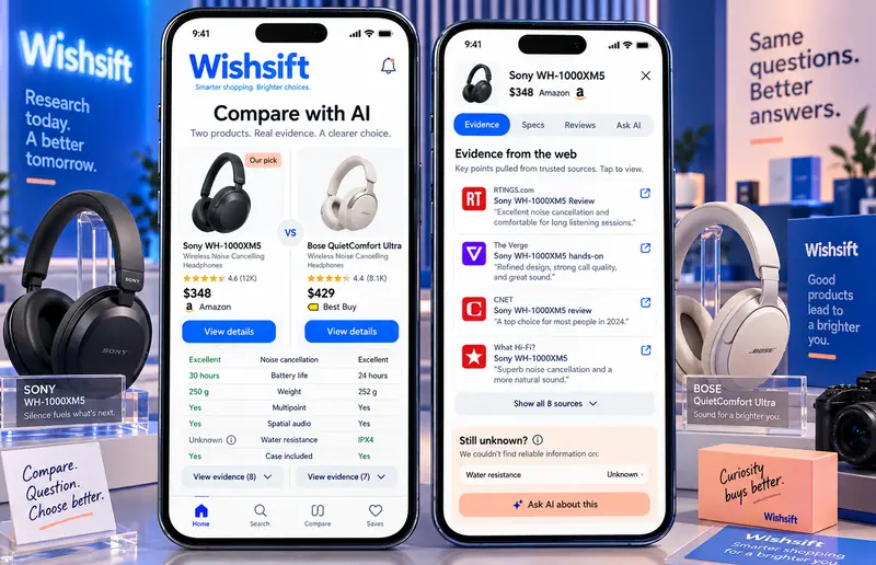
Wishsift Mobile App hero

Original mobile interface concepts with fictional content. AI responses illustrate proposed interactions; they are not live model results.

Challenge

Shoppers need to compare saved product information without mistaking a generated recommendation for verified specifications. On a phone, the person also needs to capture information quickly, understand where an answer came from and return to the original material without navigating through a dense desktop interface.

  • Keep shortlist capture and compare with ai connected within a short mobile flow.
  • Make specification extraction correctable when the model misreads the input.
  • Explain preference ranking through visible references or user-selected preferences.
  • Keep changes, sharing and data retention under explicit user control.

Solution

The design begins with a side-by-side product comparison with evidence drawers, using large touch targets, short task sequences and contextual sheets. Draft comparison fields from user-saved product pages. Link comparison statements to the captured source material. The companion views keep drafts, original material and accepted decisions distinct. A electric blue, white and peach visual system gives this app its own character within the collection.

  • Draft comparison fields from user-saved product pages.
  • Link comparison statements to the captured source material.
  • Explain a suggested ordering using explicit user priorities.
  • Mark missing specifications instead of filling them with guesses.

Results

  • 4

    Original mobile
    showcase views

  • 12

    Designed
    feature areas

  • 4

    Proposed AI
    workflows

Let’s CraftingVisual ImpactStart a Project

We Are Available For New Project

Wishsift
Mobile App

Project Type
Concept Study
Industry
E-commerce
Services
Mobile App & AI Design

Overview

Wishsift explores shopping research through a mobile experience built around a side-by-side product comparison with evidence drawers. A shopping research app that connects product comparisons to saved evidence and personal priorities. The proposed journey connects shortlist capture, compare with ai, preference brief, decision journal. Four original phone showcases establish the visual direction, while the case study defines the supporting feature set and a proposed React Native architecture.
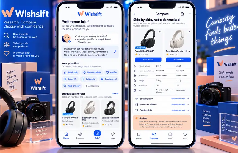
Wishsift Mobile App — hero

Original mobile interface concepts with fictional content. AI responses illustrate proposed interactions; they are not live model results.

Challenge

Shoppers need to compare saved product information without mistaking a generated recommendation for verified specifications. On a phone, the person also needs to capture information quickly, understand where an answer came from and return to the original material without navigating through a dense desktop interface.

  • Keep shortlist capture and compare with ai connected within a short mobile flow.
  • Make specification extraction correctable when the model misreads the input.
  • Explain preference ranking through visible references or user-selected preferences.
  • Keep changes, sharing and data retention under explicit user control.

Solution

The design begins with a side-by-side product comparison with evidence drawers, using large touch targets, short task sequences and contextual sheets. Draft comparison fields from user-saved product pages. Link comparison statements to the captured source material. The companion views keep drafts, original material and accepted decisions distinct. A electric blue, white and peach visual system gives this app its own character within the collection.

  • Draft comparison fields from user-saved product pages.
  • Link comparison statements to the captured source material.
  • Explain a suggested ordering using explicit user priorities.
  • Mark missing specifications instead of filling them with guesses.

Results

  • 4

    Original mobile showcase views

  • 12

    Designed feature areas

  • 4

    Proposed AI workflows

Let’s Crafting

Visual Impact

Start a Project